The Importance of an Optimized Checkout Page
While a checkout page seems trivial in the grand scheme of things, they indeed play a bigger role than expected when it comes to helping you boost conversions.
Wondering how?
Consider this scenario: a customer walks into a brick and mortar store, picks the items they need, proceeds to the billing counter to checkout but finds the process complicated or inefficient. They’re probably going to complain about it and in the worst case, drop their purchase and never return.
The same scenario can happen to a customer who is shopping at your e-commerce store. As an e-commerce merchant, you don’t want a potential customer to quit half-way through a purchase. It is in the best interest of your business to make the checkout process simple for users so that they become happy customers.
Research from Baymard Institute shows that 69.99% of online shopping carts are abandoned. If you take a deeper look and analyze the reasons behind these abandonment rates, you’ll be able to see that 7 out of 11 cart abandonment incidents are due to checkout-related reasons.
Thus, optimizing your e-commerce store’s existing checkout practices and increasing sales is paramount. Let’s start with the guidelines that you need to follow, if you’re looking to create a great checkout page.
Best Checkout Page Practices That E-commerce Businesses Must Follow to Boost Conversions
1. Optimize the look of your checkout page
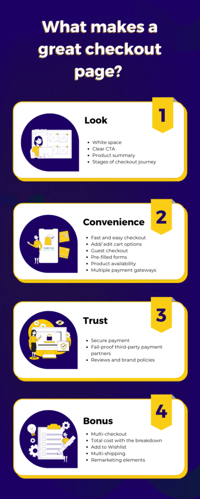
The design and appearance of your checkout pages must be the first priority in your list, as it is the first thing the shopper would take a look at as they proceed to checkout their cart. Here are multiple smaller goals you can achieve to adhere to the User Interface (UI) guidelines of checkout pages.
1.1 Leave a lot of white space – Checkout pages that are cluttered can result in misclicks and frequent distractions. Thus, leave out a lot of ‘white’ space with balanced elements.
1.2 Have a clear CTA – A checkout page is no good if there’s no proper destination to take the shopper to. In such cases, you can display call-to-action buttons in contrasting colors to avoid confusing the user and help them make better decisions.
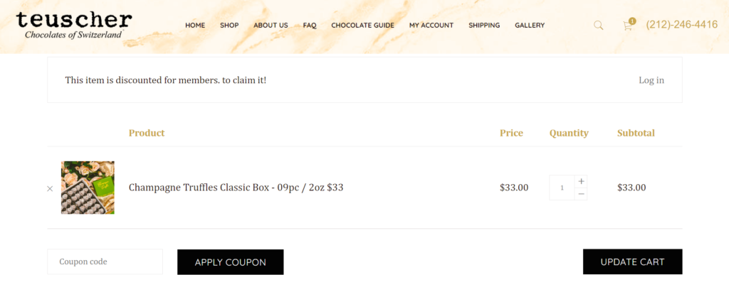
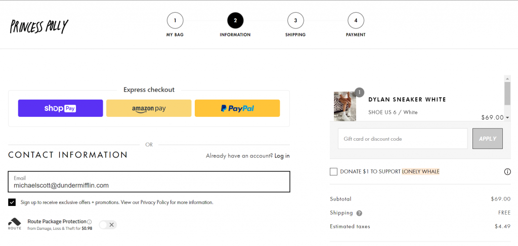
1.3 Display product summary – Provide a product summary with size, color, and other specifications, to give the user clear information regarding their order. This allows them to re-check their orders and make appropriate changes , if required. You can also extend providing summary to the other steps in the checkout process in terms of product price, payment method, shipping options, etc.
1.4 Keep the shopper updated about the stages of the checkout journey – Shoppers can be an impatient bunch, who can drop off if they have no clarity of the checkout process. To keep their anticipations in check, you can display the stages of checkout left by highlighting the stage of checkout they’re currently in. Such additions to your User Interface can ensure that your customers successfully proceed towards payment.
2. Offer convenient checkout options
Once you’ve attracted the customer with the look of your checkout pages, the next step is to make sure that they stay on it long enough to make their purchase. That’s where you come in to offer a great deal of convenience to your customers by making checkout simple and easier with an optimized User Experience (UX).
28% of the shoppers quit their shopping half way through citing a too long/ complicated checkout process.
2.1 Shorter checkout process – One of the easiest ways for a smooth checkout is to make the entire process limited to just one page at the most. This is because long checkout processes tend to frustrate the customer, who might drop off without completing their purchase. Here are other ways to reduce the time taken to check out:
- Instead of waiting for the customer to hit the button that takes them to the next step, show visual error indicators in real-time, thereby helping users correct their mistakes while filling their forms.
- Talking about forms, obtain only essential information from the user. Keep a frictionless checkout process in mind and act toward it. Fewer the form fields a user has to fill in, the smoother the checkout process will be.
2.2 Offer add/edit options – As much as you want your customer to proceed with their checkout, compelling them with checkout but nothing else might not be the best ploy. This is where you can make provisions for users to update their details such as cart, contact details, shipping options, etc at any time close to checkout.
2.3 Encourage guest checkout – 22% of users abandon their cart for the sole reason that e-commerce sites prod them to create an account. This can be avoided by enabling guest checkout. Exclusive discounts can be offered to users who register and create an account.
2.4 Pre-fill forms – Enable pre-filling of form details such as the city and the state once the user has entered their zip code. Pre-filling can be enabled even for guest users when they visit the site to shop for a second time.
2.5 Highlight product availability – Give your user a heads up on the availability of a product in the store. “Sorry, we’re out of stock” messages after the user checks out will frustrate them. In the case of a fast-selling product, you can display the number of items left in stock or the number of business days in which you can replenish the stock. For example, you can provide the customers with the option of checking the availability of a specific product, by asking them to just enter the zip code.
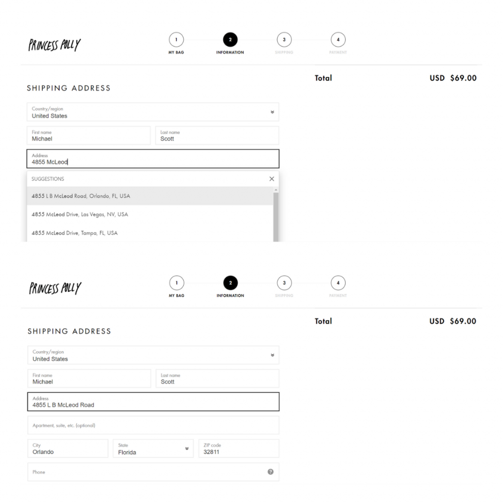
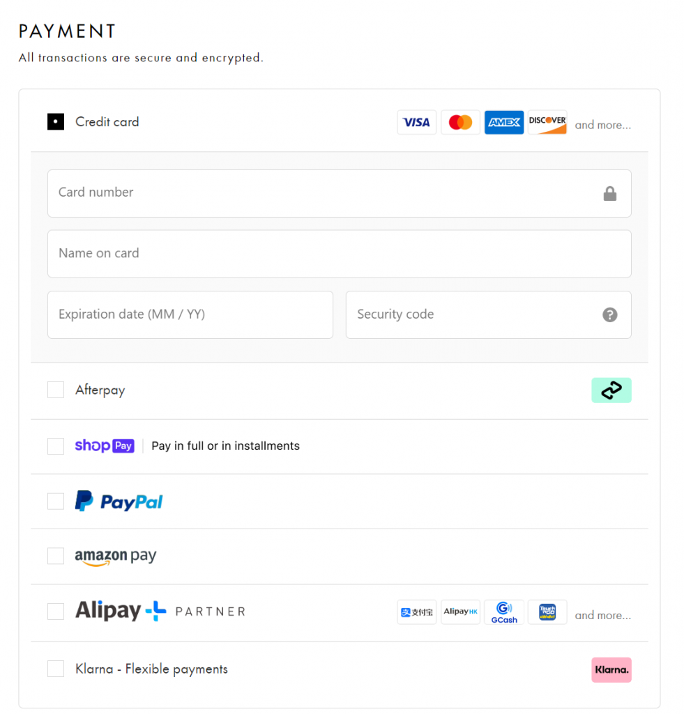
2.6 Integrate with multiple payment gateways – Your customers’ shopping experience can take a hit when they feel they are forced to make a decision and a lack of control. This can extend into payment as well. To resolve this issue, you can integrate with multiple payment gateways such as Credit and Debit cards, Digital wallets, Online payment services, or provide the option of Cash on Delivery.
3. Make your checkout page trustworthy
One more way to ensure your customers proceed with their checkout process is to properly communicate that your checkout page is secure. This gives a psychological satisfaction to users and increases the amount of trust they invest in a website.
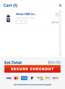
3.1 Offer secure payment gateways – According to Baymard‘s study, 17% of users who abandoned their cart didn’t trust the site with their credit card information. This situation can be dealt with by displaying a secure connection certificate (the lock icon) This confirms that the information on the site is secure. You can also display payment trust badges from sites like Norton and McAfee.
3.2 Stay in control of the payment process – 4% of the users abandon their cart during checkout just because their payment failed once. Ensure all your payment gateways are responsive and properly communicate such information with your customer (proactively if possible) to prevent permanent cart abandonment.
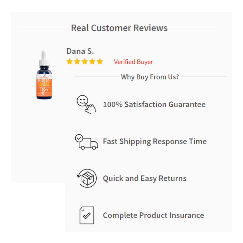
3.3 Display reviews and brand policies – Your customers can have doubts even at the last-minute before making the purchase. To clear those doubts and motivate them to make that decision, you can display reviews from real customers and brand policies such as shipping and delivery-related stuff, customer support features, etc.
4. Extend the capabilities of your checkout page
All the above points ensure that your customers complete their purchase but that’s just the bare minimum in today’s competitive space. You need to put your money on repeat purchases and make efforts to make your customer come back to your store for more.
From ways to offer your customers a delightful experience to remarketing techniques, here are some elements that you can incorporate into your checkout pages as a bonus.
4.1 Enable Multi-checkout – Enable the user with multiple checkout options such as direct checkout or checking out via viewing the items in their cart. In case if the customer chooses the latter, you now have your chance to optimize your checkout page to the fullest by marketing similar products to make customers buy more.
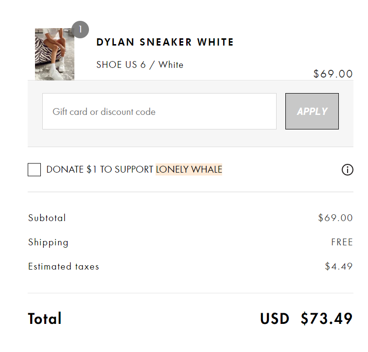
4.2 Include the shipping cost in the product price – Displaying the final price (inclusive of all shipping and taxes) is key to making a user buy the product as over 20% of users abandon their cart just because of an inability to calculate their total order.
4.3 Add a ‘Wishlist’ option – Talking about costs, did you know that sometimes shoppers can simply abandon a purchase just because they felt that it was expensive? Yes, 54% of shoppers would buy a product on the cart if given a discount. With a product in the wishlist, you can also motivate the customer to shop for another item as well.
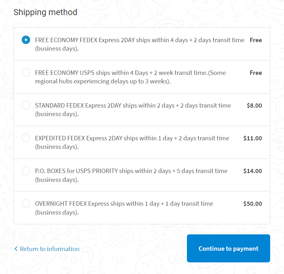
4.4 Provide multiple shipping options – One more addition to your list of cost-efficient techniques is to provide multiple shipping options based on the user’s budget and delivery date expectation. You can also spur the customers to make that decision at this stage by offering free shipping for later delivery days and same day shipping options for customers who badly need that product in their hands.
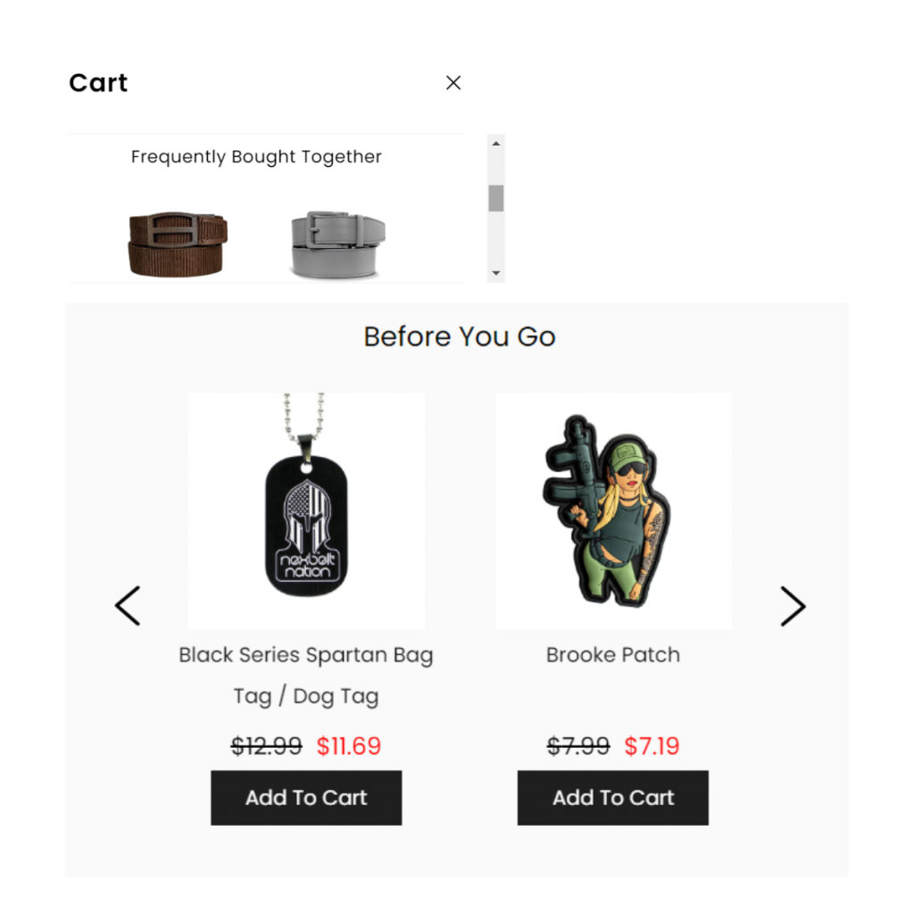
4.5 Include remarketing elements – Spur your customers to spend more in the same order by plugging remarketing elements such as personalized cross sell recommendations or marketing campaigns on your checkout page to boost sales.
Conclusion
A quality checkout page is not born overnight as mere implementation will not suffice.
Frequent testing and optimization are necessary based on variables such as demographics. Always consider the need for improvement.
Compare all of your features and bring those that boost customer experience to the forefront. Look for ways to get feedback from existing customers. Also, stay in touch with them regularly by updating them with upcoming offers.
