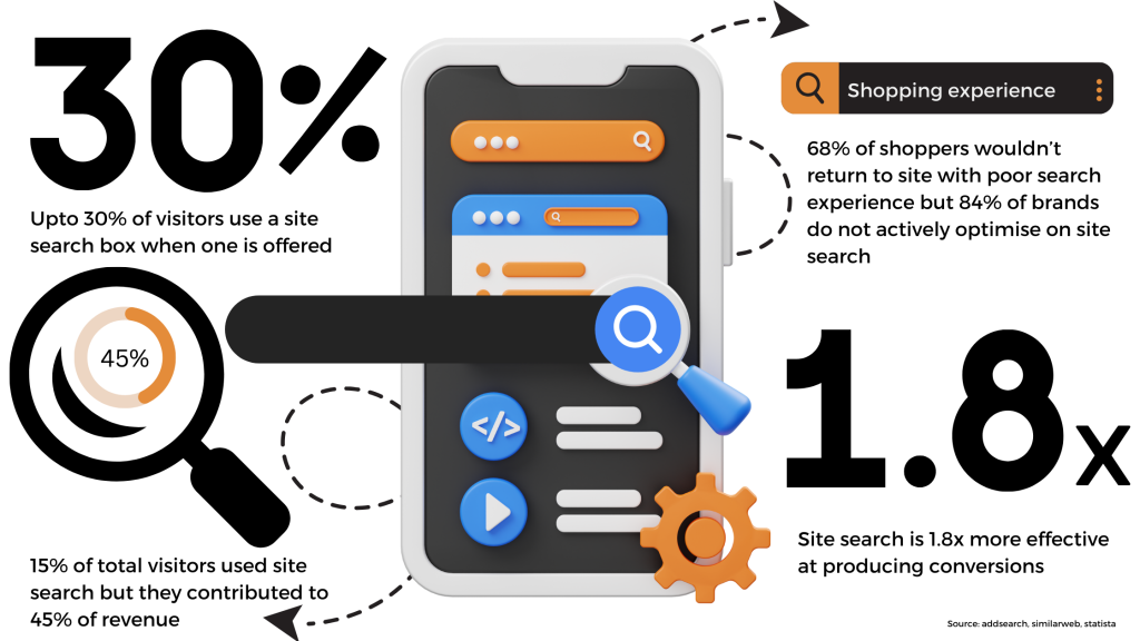
Did you know that, Nearly 84% of e-commerce brands don’t actively optimize or measure their on-site search. (adsearch.com)
Site search is a very important feature of an e-commerce store. It helps customers find the products that they are looking for efficiently and quickly. Site search should be a feature that suits all the customers who visit the website. It leads to higher conversion rates and helps extend the longevity of the time spent on the website by an average customer.
Site search can be used to determine a number of business analytics.
- Businesses can know what their customers are frequently searching for: The customers might search for products that are provided by this e-commerce store. When they find it, they are directed to that specific product page. When customers search for products that aren’t sold by the e-com store, businesses might take that chance to identify the gap in their product range and realize what customers want to see the brand sell.
- Content and product optimisation: When businesses gain insights on what customers are frequently searching for, they can know which product is popular among the consumers, and optimize those product pages. Matching your customers’ search terms with the language you use is crucial for your search engine optimisation strategy.
- Providing Personalized experience: Personalization is a very important aspect in e-commerce businesses right now. When shoppers search for a particular product on the search bar, personalized recommendations can be displayed, based on their previous shopping journey with the brand
Some Stats on Site Search

How to increase conversion rates on the ecommerce store using site search?
1. Make sure your search bar is visible, Duh!
We know, we know. It sounds redundant to even say it out loud! But imagine, if the site visitors have to search for the search bar, it doesn’t really make any sense. :/ Enusre that its prominent and noticeable.
Best practices for a search bar design:
- Place it in a very predictable place.
- Include the search icon and the word search in the search bar.
- Add a camera icon on the search bar to make it easier for the customers to browse a product through the image they already have.
- Choose an appropriate size.
- Enable the auto correct and auto complete features.
- Place your search bar on each page.
- Include all the most recent searches made by the user.
- Clarify what users can search for
2. Allow to search with images
As we all know, social commerce has been a very big influence on making a purchase or decision in the last few years. Influencers, people tend to adapt to the influencer lifestyle and they want to buy things that celebrities use. So they take inspiration from social media and they want to search such images on the e-commerce brand that they want to purchase from. This is where the search with images option comes in handy. If you can include such an option if possible, then it would result in a very high conversion rate. This can benefit you in the following ways:
- Enhanced customer experience
- Visual inspiration
- Higher conversion rates
- Competitive advantage
- Improved product discovery

3. Allow typo corrections in your site search
Typo occurs when a customer searches for a particular term but misspells it. Let’s agree that many of us tend to type a word quickly and end up making a typo. But an e-commerce business cannot display no results for such typos. They should actually employ a number of techniques and make a typo correction. The number of techniques include a dictionary lookup, n-gram analysis, similarity keys, rule-based, probabilistic, neural-based, edit distance, etc.
Why do you need this typo correction in your site search? It is for the following reasons:
- To enhance users’ search experience,
- To reduce the number of bounces from the website
- To save time
4. Customize your 404 page
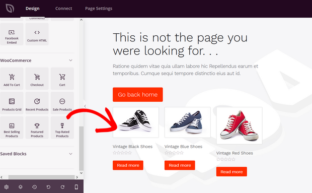
You can expect customers to search for products that aren’t actually present in the website. In those times, the website will typically display a 404 page where it says that the particular product is not found. But don’t let that 404 page be the deadline for your website. Because the next solution people think of is to jump to your competitor’s website and look for products they want. In such a case, you can customize your 404 page to suggest a few relevant products to the search term in order to reduce the bounce rate.

5. Optimize for mobile search
There’s no doubt that mobile usage has been increasing over the years and it would be a healthy option to optimize for your mobile as well.
The less number of typing and less number of browsing leads to more number of navigation to product pages and ultimately to more number of conversions . Make sure that the filtering options conforms to the size of your mobile device.
6. Cater to customers who know what they want
Spearfish users are the users who come to a website knowing what they want, exactly what they want. These users, when they come into a website, according to a Forrester research, 43% of them search for a search bar and enter their query, and most of them come with the intention of shopping in the website. Help those your Spearfish customers, include a predictive search and autocomplete to make them search for their products easily.
7. Display product image in search
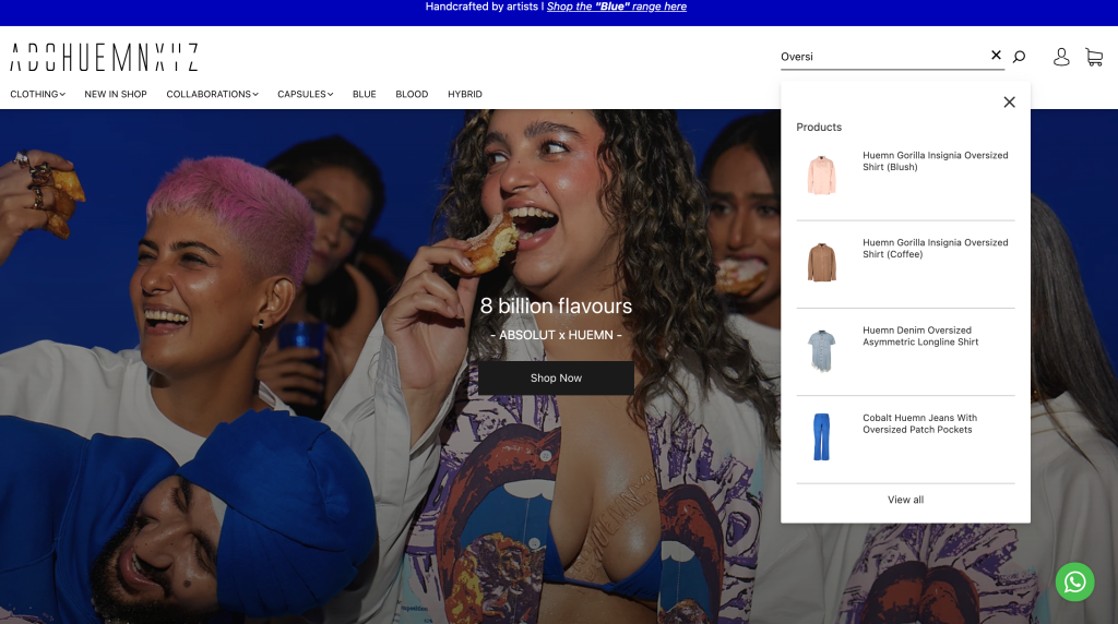
Displaying product images when a site search is done is a very helpful feature. It enhances the visual experience. It promotes cross-selling as well because the user will be exposed to a number of variety of options available on the e-commerce site. It would be better for the product identification since the image itself is displayed and it would aid in better decision making.

8. Use filters and sorting in site search
Don’t overwhelm the users with your site search result displays.
Adding the filtering and sorting feature to your search option is just one step closer to conversion. When people directly filter out options based on what they need, it’s just easy for them to navigate themselves to that particular product page.
Some best practices for these filtering and sort options are as follows.
- Do not display a very big list of filtering and sorting options. Just hide them and make these options drop-down menu accessible.
- Make sure that the filtering and sorting options that are selected are displayed on top of the page.
- According to your users’ needs, prioritize which option you display first in the filtering and sorting options.
Final Word
As stated above, most brands do not concentrate on their site search optimization. Imagine that you type something on Google and you’re unable to find it. It’s the same case when it comes to your e-commerce business. A good site search bar is the fine line between a happy customer and a frustrated customer. Don’t let your customers leave your site with a bad experience.
Besides, site search optimization further helps you understand your target audience better. It would be a waste of time and energy and money if all the customers brought into your website through immense marketing efforts just convert less!


